Saturday, 28 November 2015

Emulation


Here, I drew my outline first, and added watercolours and oil pastel as my base colours.

Adding colouring pencil

Here I have added paints and more colouring pencil

Adding acrylics


I used oil pastel on the crown

I used colouring pencil on the flowers


Ink wash on the background 


Editing levels

Editing curves

Changing the vibrance

Increasing the saturation

Editing the lightness 


Finished piece


For this piece, I created an emulation of my work in the style of Marjolein Calijouw, using the same techniques as I learnt when I created an artist copy of one of her piece, 'Bird Braid.'

Tuesday, 17 November 2015

The Raven Princess: storyboard/book plan

Here is the storyboard plan of the book, and you can see which image will be on each page, and how the book will be made.

Tuesday, 20 October 2015

Marjolein Caljouw- "Bird Braid" copy

"Bird Braid"- by Marjolein Caljouw. I love her work, and decided to copy this image.

Basic outline

Beginning to add details

I then started to add paint
Basic colours put down 

I then started to add oil pastel and pencil


Finished, with edited levels in photoshop 


Wednesday, 7 October 2015

Artist copy

Image that I copied: Taken from 'Fairy Dust and the Quest for the Egg' by Gail Carson Levine. It is illustrated by David Christiana.

My copy of the image above


Edited in photoshop 

I followed this process to create my image, and added pencil at the end to add needed detail.

Tuesday, 15 September 2015

Photo contact sheet

These are my images that I took to help me with my ideas. Here I have annotated them to show which were good quality, which could help me and those that were not so good. 

Subject Matter Photography Slideshow

Thursday, 10 September 2015

Digital Types

Annotated digital types which I could use on my work. I really like 'True Lies', the second type on the sheet.

Friday, 10 July 2015

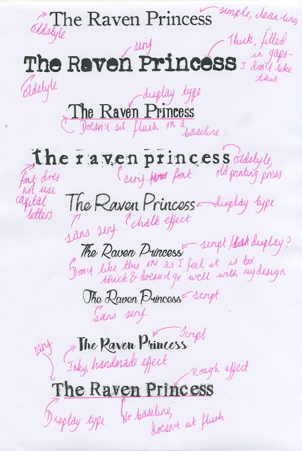
Hand-drawn Type ideas


Here I created several pages of different typographies, and I refined my favourite design. Creating these allowed me to design new fonts I could use within my work.

Thursday, 2 July 2015

Design draft


Here, I created an image of what I would like my final design to look like. There are elements of which I am still unsure of, such as the biro flowers, but this is the piece of which I am going to base my final design on. 

Edited levels in PhotoShop

Wednesday, 1 July 2015

4 refined scamps


4 refined scamps. I used watercolour, pencil and biro

Analysis of scamps, from top left to bottom right:

1. I incorporated flowers and feathers to help emphasise the nature theme running throughout my story. This is my favourite design because I love the mask and the shape of her profile. The colours I chose were simple tones, yet the bold red lips help the image to 'pop out' of the page.

2. For this design, I still wanted to have her look of calmness, yet I wanted the image to be of her whole face. This is because it gives a better idea of what the character looks/is like. Again, on this scamp I have placed both the story name and my name at the bottom of the drawing. This was done because it isn't ruining or taking over the image, and you can fully see the picture without having anything in the way of the whole image.

3. This scamp that I have created is my least favourite. I dislike the drawing of her face, particularly the lips; however, I was experimenting with refining the scamp before, hence why her eyes are open here. I have again included feathers and flowers, because of the nature theme and also because she has wings. I have not drawn these on any of my designs though, because I feel that it might somewhat ruin the look of the drawing. The writing here is placed at the top and bottom of the image because it would otherwise be in the way of the image.

4. I really like this design. Again, here I have gone for a design of her face with a full-frontal view. It is closer up here, and I have therefore picked brighter shades to help the image stand out: blues, greens, red and fuchsias. These shades help the tones of grey to 'bring the image alive' because the contrast of the colours are what make the image so eye-catching. Both the story title and my name are at the bottom of the image to emphasise the image itself.